You are here: Help » Searching » Genes » Batch Query
Seaching (Genes)
Batch Query (Summary)
A list of genes or sirna IDs can be used to gain an overview of the information relating to these genes or siRNAs accross all of the large-scale screening projects in our database.
We have several genome wide screens that have produced readouts that can be grouped in order to give an overview of screen scores for different biological processes. Each dataset that is associated with a screen is fit into a search category if it is applicable. For example, for several screens we have measured cell number, either using the TTP Acumen explorer, or using the Cellomics ArrayScan. It is useful to compare the score of genes across all of the screens that measure similar biological aspects. So far we have grouped data into several categories such as:
- Cell Viability - this includes measurements that estimate the number of cells within a well
- Cell Cycle - this includes measurements from the Acumen Explorer
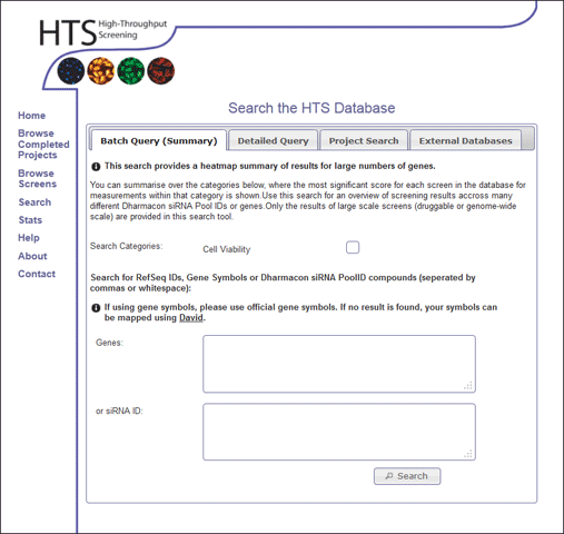
This type of search can be accessed using the "Search" option in the main menu, and selecting the Batch Query (Summary) tab. The user can select the search categories they wish to search for, and enter either a list of genes (symbols or refSeqIDs) or Dharmacon siRNA IDs (seperated by white spage or commas) (Figure 1). The user can not enter two types of search at the same time (ie it is required to either search for gene IDs or search by siRNA ID). Please note, if the gene symbol is not found, it might be that an alternative symbol is available in our database, so it worth checking alternative gene names, and if there are any problems, please feel free to contact the HTS lab.
Batch Query Results
The results of the search summary are shown as a heat map, so it should be easy to identify those genes that are having strong/weak positive/negative effects over different groups of screens and data readouts within the database.
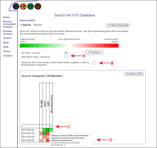
The colour of the heatmap is based on the rank of the gene within each dataset, so even if the datasets are on different scales, they can be compared accross screens and viewed in terms of significance.
The types of data readouts that are included in the heatmap are listed, and the user can choose whether to include or omit different measurements, based on the implications for analysing the results (Figure 2, Arrow A). If the user selects or deselects one of these measurements, the refresh button must be clicked in order to see the changes within the heatmaps.
The user can also decide whether to include or omit screens with different treatments (ie drug) based on whether these "treated" screens represent a true value and may skew results (Figure 2, Arrow B). Again, the user must click on the refresh button in order to see these changes in the heatmap.
Each column in the heatmap represents the data measurement for one genome wide screen, and each genome wide screen is only present in the heat map once. So, if a genome wide screen has several datasets that refer to the readout in question, the most significant measure is displayed.
The genes within the heat map are displayed in the order they were inputted into the search form (by default). However, you can also order the genes by the score within each screen (clicking the white box between the first gene and the screen name) (Figure 2, Arrow C). If you hover over these boxes, a box will appear which will describe the screen. Once clicked, the genes will be sorted according to the scores within this screen. An arrow will appear to show the direction of the sort, and on clicking the arrow, the sort direction will alternate. Alternatively you can order by the mean rank score of the gene accross all screens which is shown in the right-most column of the heat map, or sort by the gene name (by clicking on the square above the names).
Each square on the heatmap represents the rank score of the gene on that row within the screen in that column. To understand more about the screen and the dataset used, the user can hover over each square to get more information (Figure 2, Arrow D).
Each heat map can be saved as a PDF using the Save to PDF button on the top right corner of the heat map (Figure 2, Arrow E). This opens a PDF display of the heat map. Please note, this PDF file is a temporary file on the server, and needs to be saved by the user for future reference.