You are here: Help » Database Basics » Data View » Analysed Data View
Data View
There are two types of data view within the database.
- Analysed Data Set View
- Deconvoluted Data Set View
Analysed Data View
The analysed data view page summarises each analysed data set within the database and allows the user to view the results of each screen, as well as viewing the source raw data. There are several options to query the data.
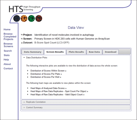
Screen Results
The Screen Results tab summarises data in view of the whole screen.
Data Distribution Plots
The user has the choice of 3 interactive data graphs to show the distribution of screening data. For more information on the graph interactive tools please see [here].
- The first graph plots the score against the rank of each screened well. This can be useful to see the spread of data, how the outlying negative and positive ends relate, and also where controls and hits lie with respect to the majority of data points.
- The second graph plots the score against the plate number, so the distribution of scores at each plate can be viewed. This is useful to identify whether there are problem plates within the data set, identify how the controls are behaving on several plates, or identify if there are more hits than are expected from certain plates.
- The third option of a graph plots the scores against each well position. This is again useful to identify any problems with the dataset such as positional effects. It can be useful to identify where your gene of interest lies with respect to all other genes at that position within the screen.
The user can also view heat maps of each plate within the screen, as well as each replicate of raw data. These heatmaps colour the position of each well based on the score or raw data associated with each well. The well positions can be hovered over in order to view a tooltip describing the well contents. The user can also click on the individual squares that represent wells to see the Project Compound View of that compound within the project they are currently in. More information on the heat map tools can be found [here].
Replicate Correlation
To view replicate correlation across the whole screen the user can view correlation plots of replicate pairs. Since the analysed data summarises the score accross replicates (so there is only one value per well per plate) the replicate correlation plots are produced using the raw source data.
These graphs open in the interactive graph window, for more information on how to use this tool click [here].
An additional tool provides a heat map view of the standard deviation of wells between replicates of all plates within the screen. The standard deviation of replicate values for each well is calculated, and the assoicatied well is coloured according to this standard deviation within the heatmap.
For more information on understanding the heatmap, click [here].
Control Summary
To understand which controls are used in the screen a summary is provided for the well positions and types of controls used. The mean control value at each well position across the screen is given. With some screens, control configurations may vary from plate to plate. If this is the case, each control configuration is shown, together with the plate numbers it refers to. The mean values of the well positions of each configuration is shown.
A neutral control is not expected to have any effect within the assay used (Z-score of 0, POC of 1). A positive control is expected to have a positive effect on the assay (ie increase in spot count) and should score highly in the analysed data set. A negative control is expected to have a negative effect on the assay and should have a low score in the dataset. Careful interpretation is required however, as some controls might not apply to some readouts and different readouts may alternate the effect of positive/negative controls.
Plate Results
If the user is mainly interested in specific plates of a screen, or are looking for a certain gene at a known well position it can be useful to view the data by individual plates. The plate results tab gives a plate summary and control summary of each plate number. The user can change the plate displayed by choosing any plate number from the screen.
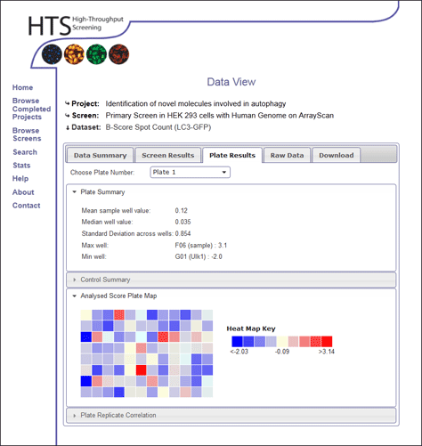
Analysed Score Plate Map
Within plate view, individual heat maps are shown using the analysed data scores associated with wells on the chosen plate number
For more information on understanding the heatmap, click [here].
Plate Replicate Correlation
This section allows the user to view replicate correlation for individual replicate pairs of one plate. Since the analysed data summarises the score accross replicates (so there is only one value per well per plate) the replicate correlation plots are produced using the raw source data.These graphs open in the interactive graph window, for more information on how to use this tool click [here].
Raw Data
The raw data that is the source of the analysed data set can be viewed within this tab. An analysed data set may be the summary of several raw data sets (such as a rank product of different readouts). For this reason, the user can select which raw data set they wish to interrogate within this section.
Within this section, if the user choses a plate number, they will also get the opportunity to view the raw data for a given plate.
View Plate Details
This provides a summary of the replicates that represent this plate number. We can see whether all replicates are present in the database, and see summaries of the raw data within each replicate to see how replicates compare.Raw Data Plate Maps
Within this raw data view, heat maps of replicate raw data values are shown for the chosen plate number. The value at each well position directly corresponds to each individual well value of a specific plate for this particular readout.
For more information on understanding the heatmap, click [here].
Standard Deviation of Plate Replicate Wells
An additional tool provides a heat map view of the standard deviation of wells between replicates of the chosen screen. The standard deviation of replicate values for each well is calculated, and the assoicatied well is coloured according to this standard deviation within the heatmap.
For more information on understanding the heatmap, click [here].
Download
Individual datasets can be downloaded for both raw and analysed datasets. The choice of dataset can be identified in the Download tab, and the user can chose to download the complete dataset, or limit themselves to a plate range.
Data is downloaded as an Microsoft Excel file (.xls). If this is not required, please feel free to contact the HTS lab for plain text versions.