You are here: Help » Interactive Tools » Graphs »
Graphs
Several interactive graphs can be displayed using data within our database. These can be found from the Data View page, as well as the Project Compound View page.
Graph Options
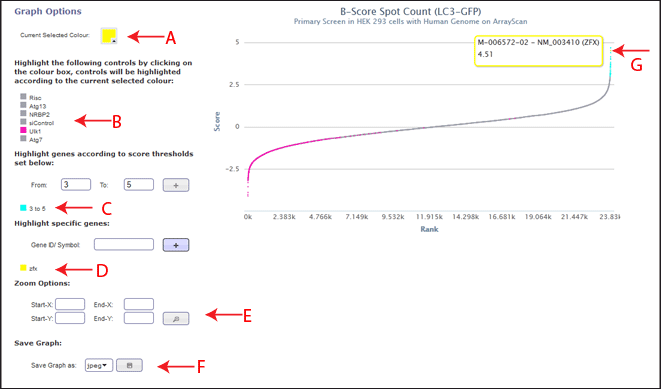
The current selected colour option at the top left of the page displays which colour is currently selected (Figure 1, Arrow A). This colour will be applied to any selections the user makes within the graph options. To change the selected colour, the user can click on the coloured box and chose a different colour. This will then be applied to future selections of controls or genes/thresholds.
All the datapoints associated with the control list can be coloured by the current selected colour by clicking the coloured box next to the control name (Figure 1, Arrow B).
In order to colour points by a user defined threshold, the user can set from (greater than) and to (less than) ranges to apply the current selected colour to. This group will then be shown in the legend (Figure 1, Arrow C). To remove this highlighting, the user can double click on the coloured square next to the required range. The user can also change the colour of the range by clicking the coloured square next to the chosen range, and it will be updated to the current selected colour.
In order to highlight a specific gene, the user can enter a RefSeq ID or gene symbol and if it is present in the data set it will appear highlighted in the current selected colour (Figure 1, Arrow D). The gene name will then be shown in the legend, with an assocaited coloured box, showing the colour of the highlighting. To remove this highlighting, the user can double click on the coloured square next to the gene ID/symbol. The user can also change the colour of the range by clicking the coloured square next to the chosen gene ID/symbol, and it will be updated to the current selected colour.
If the graph is displaying a large data range, and the user wishes to zoom into a certain area of points (for example, only view the positively scoring genes), start-x and end-x ranges can be entered (Figure 1, Arrow E). Start-y and end-y ranges can also be entered. These values refer to the associated axis, so if only the start-x and end-x values are defined, the graph will be zoomed to that area of the x-axis, while the y-axis display will remain the same.
The current view of the graph can be saved as a jpeg, png or pdf file at any time (Figure 1, Arrow F). This may take a minute to load if the graph contains a lot of data points.
If the graph contains a large number of data points, (for example a genome wide screen contains 20,000), the interactive options can only be viewed and changed when the graph is not loaded. In order to switch from interactive mode to the graph view the user must click the box that appears over the interactive options. In order to load the graph with the new options selected, the user must click on the box that appears over the graph. This will not be required if there are fewer data points, and the graph will automatically update when the interactive options are changed by the user.
Graph Tooltips
The graph is annotated so that on hovering over data points, the associated annotation will be shown (Figure 1, Arrow G). If a "Many Samples Cover This Point" message appears, annotation can not be shown because the mouse position hovers over more than one data point.
Graph Light View
In some circumstances, the graph view will load without interactive options. Within this view, you can chose to open the full interactive version by clicking the open interactive graph button. This will open a full interactive view of the same graph in another browser windown. Within the light view, you can still hover to generate tooltips, and save the graph as a jpeg, png or pdf file.