You are here: Help » Interactive Tools » Heatmaps »
Heatmaps
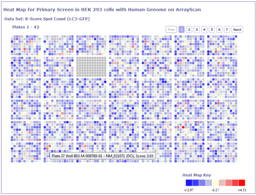
Heatmaps of screen plates can be useful to view the scores associated with a plate. These views can help identify problem regions within plates, and help inform you whether a compound score is reliable and can be trusted. Problems can be seen with controls or spatial effects can be identified.
Within the database, we provide views of raw data plates and analysed data plates. We also provide heat maps of the standard deviation accross replicates.
The plate heatmaps reflect the layout of the plate, with each coloured square representing a well. These squares can be clicked and link to the project compound view of the compound or control, whatever the content of the well that is clicked.
Each well (or coloured square) can also be hovered over to provide a tool tip describing the contents of the well, and the score or data associated with that well.
On each view, the scale of the data range and associated colour is displayed. Dark blues and purples represent low scores/values, and red and orages represent high values/scores. Green/light blue colours represent mid-values.
Within the view for heat maps associated with a data set, where there are numerous plates, plates are split into several pages, and the user can click to progress through the screen. On each page, a new data range key is generated, depending on the scores/values of plates within that page (Figure 1).